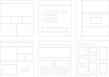
Responsive web design (RWD) is an approach to web design aimed at crafting sites to provide an optimal viewing and interaction experience—easy reading and navigation with a minimum of resizing, panning, and scrolling—across a wide range of devices (from desktop computer monitors to mobile phones).
A site designed with RWD adapts the layout to the viewing environment by using fluid, proportion-based grids, flexible images, and CSS3 media queries, an extension of the @media rule, in the following ways:
- The fluid grid concept calls for page element sizing to be in relative units like percentages, rather than absolute units like pixels or points.
- Flexible images are also sized in relative units, so as to prevent them from displaying outside their containing element.
- Media queries allow the page to use different CSS style rules based on characteristics of the device the site is being displayed on, most commonly the width of the browser.
Responsive web design is becoming more important as the amount of mobile traffic now accounts for more than half of total internet traffic. This trend is so prevalent that Google has begun to boost the ratings of sites that are mobile friendly if the search was made from a mobile device. This has the net effect of penalizing sites that are not mobile friendly.
Source: https://en.wikipedia.org/wiki/Responsive_web_design


