You have no items in your cart. Want to get some nice things?
A Post Created With Gutenberg Blocks
Gutenberg aims to bring you a whole new writing experience inside your WordPress editor. Instead of writing your post as you would in the classic way (similar to writing an article on any text processor), Gutenberg will let you create posts by inserting and combining different types of content blocks. What a way to step up your blogging game.
Artisan Themes + Gutenberg
At Artisan Themes we believe Gutenberg blocks will help you make your posts more beautiful, compelling and unique.
That’s why we put a lot of efforts into integrating and styling Gutenberg’s blocks and possible settings.
Everything you see in this post was created by using Gutenberg’s blocks and Binder PRO WordPress Theme styles.
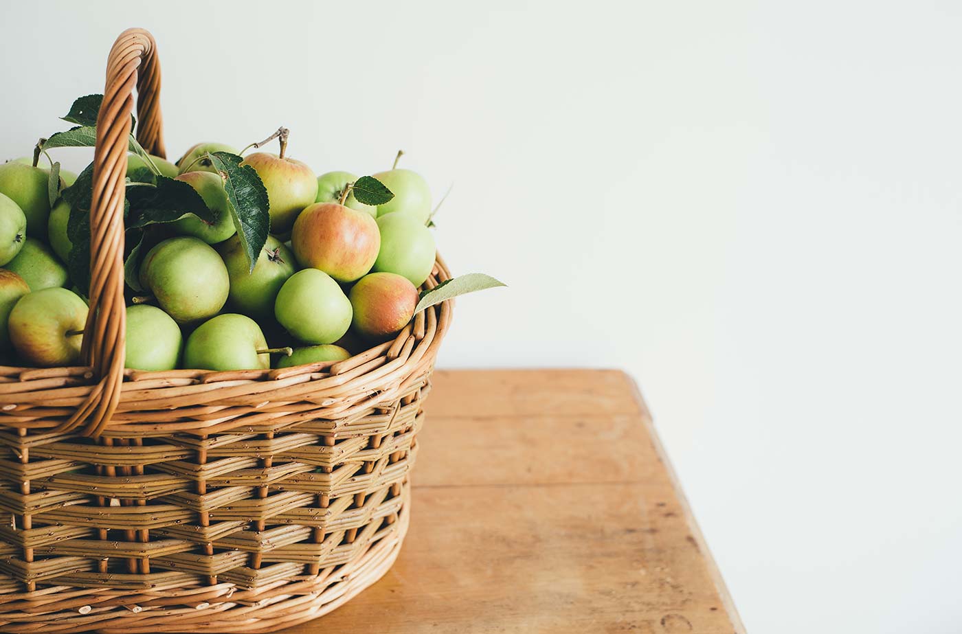
Like this Cover Image. Which is a text over an image
Gutenberg’s blocks include:
- Paragraphs & Headings
- Images & Videos
- Galleries
- Embeds, like YouTube, Tweets, or other WordPress posts
- Buttons
- Cover Images
- Separators
- Quotes
- Videos & Audios
- And Lists (like this one!)
Each of these elements is handled as a separated block that you can edit, duplicate and rearrange within your post.
Size matters… 🙂
If you ever wanted to make a full-width image or a wide quote, now you can. We’ve enabled the Wide and Full Width alignments for some of Gutenberg blocks.
So you can have an image that looks like this…

But also one that looks like this:

…And one that looks like this too!

Pretty nice, uh?
And guess what… it’s not only for images. You can use the Wide and Full Width alignments also in: Galleries, Quotes, Pullquotes, Videos, and more.
Keep reading to see some examples.
Show me the money
What you’re about to see is a random composition of some beautiful blocks you can use in your posts. I can’t promise you’ll find logic in this composition, but I’m sure you’ll get an idea of how nice your posts can look like from now on.
This is a paragraph text that has been enlarged. You can change the size of any paragraph to make it bigger.
Or to make it smaller.
You can also enable the Drop Cap to show a large initial letter at the beginning of the paragraph and make it look like a fancy newspaper article. Now, let’s fill this paragraph with a little lorem ipsum magic. The only words I remember are “lorem ipsum dolor sit
The following is a regular sized Quote. And yes, it’s something we’ve said many times and something we believe and try to live by every day.
Building your own business can be hard. But right in those moments when you feel like the climb gets steeper and results seem farther, you must keep giving. When in doubt, do more. Give more.
Artisan Themes
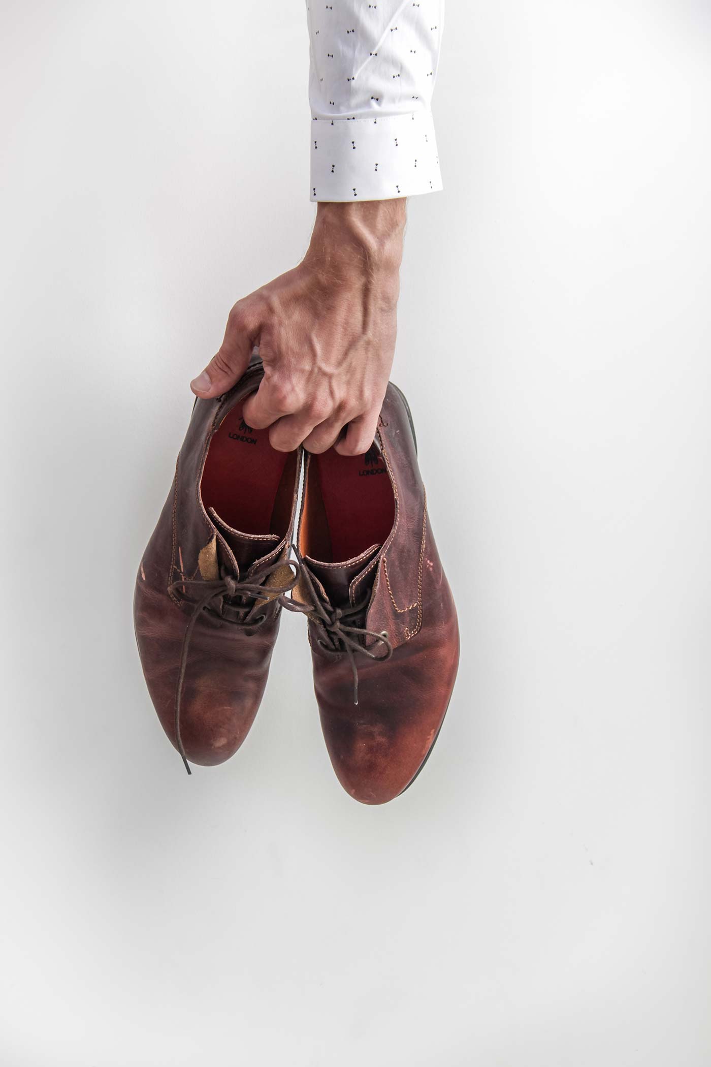
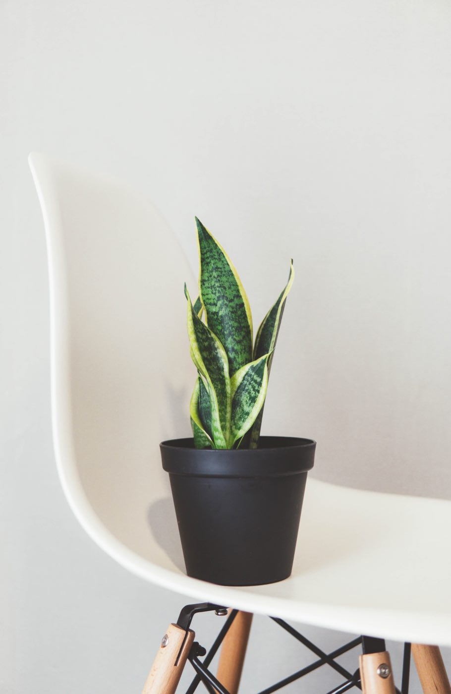
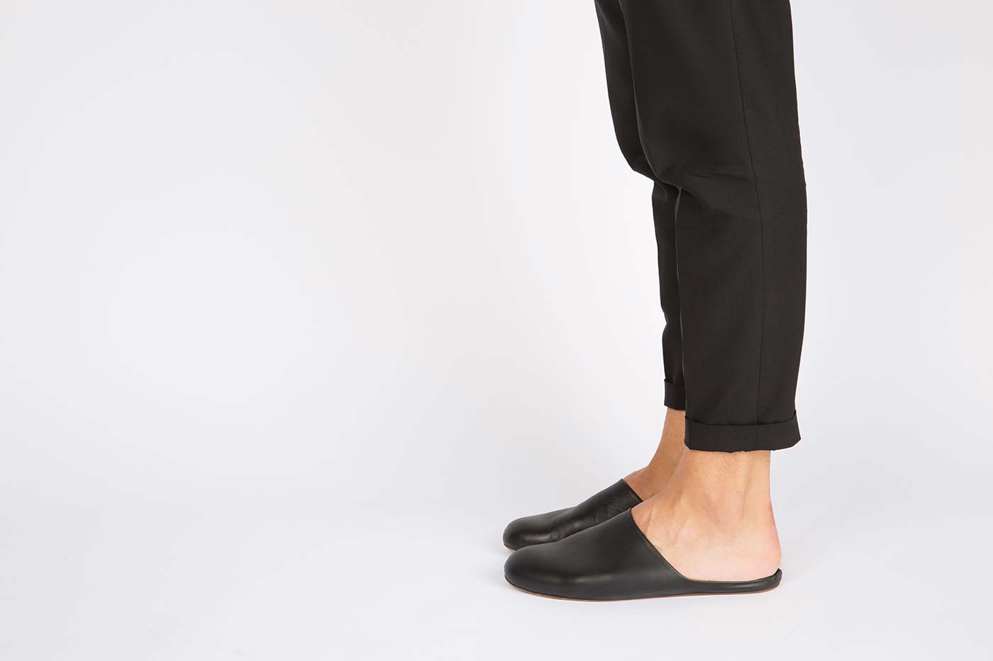
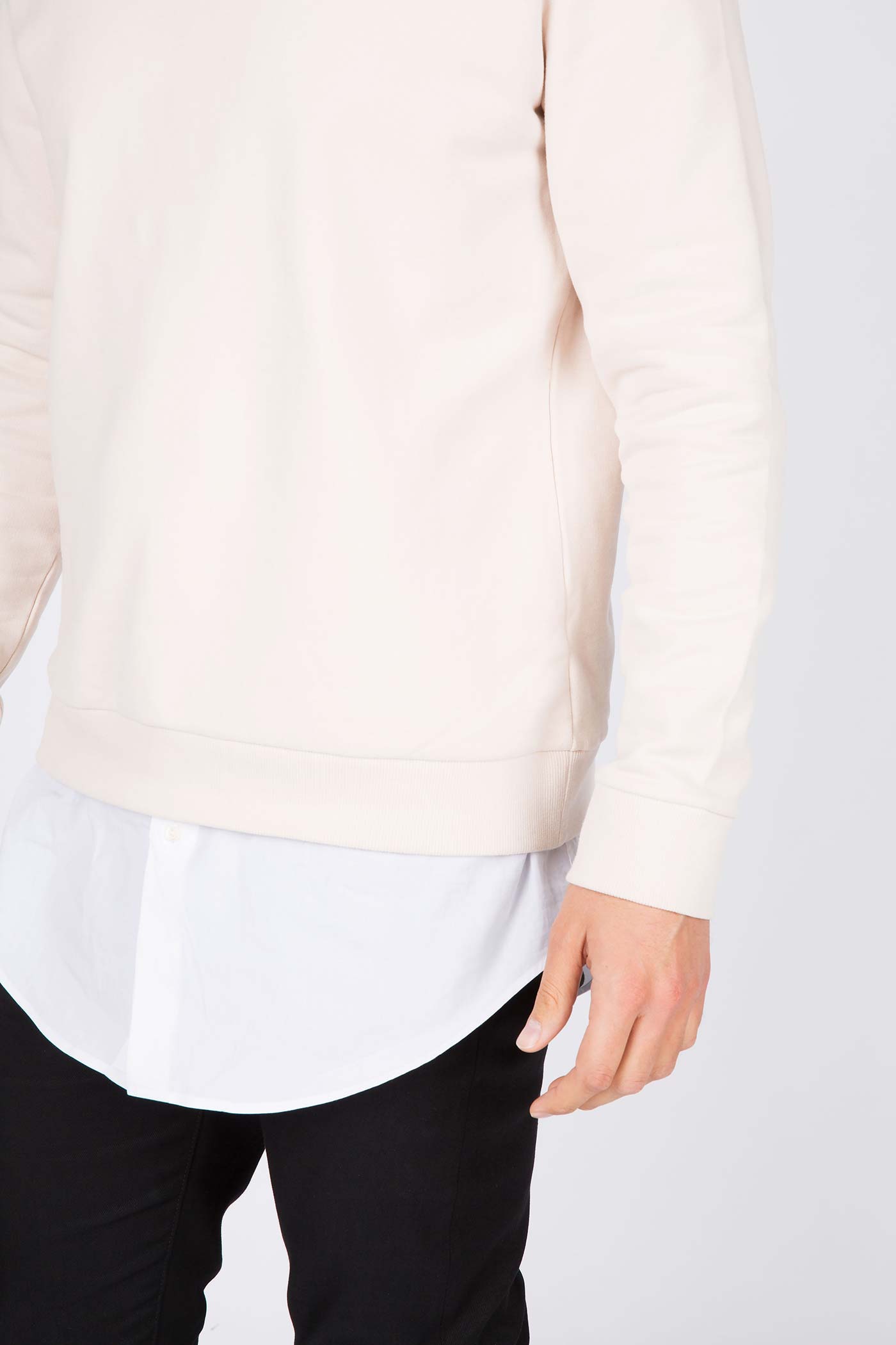
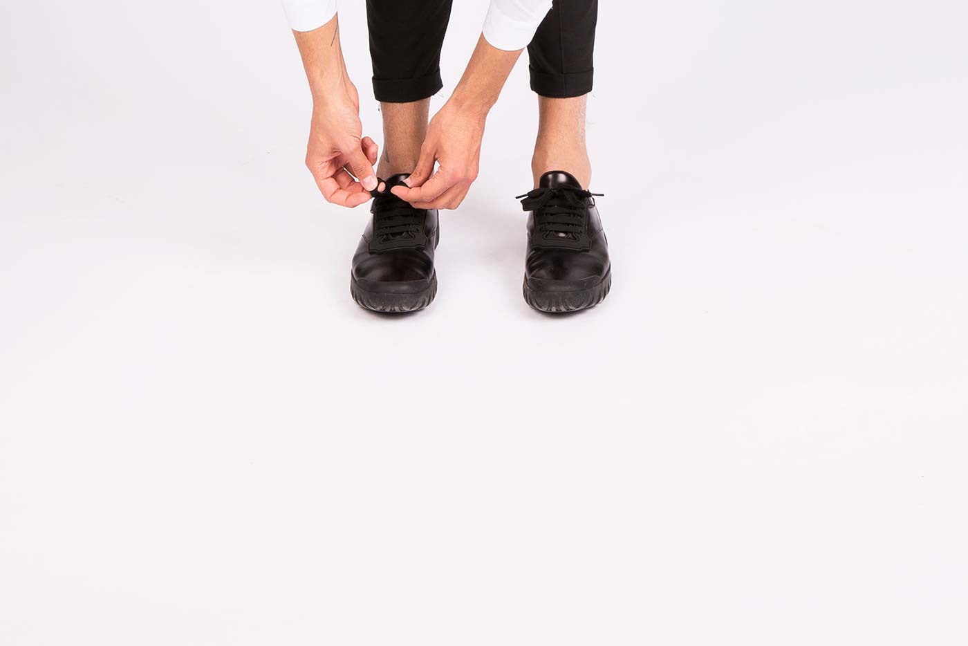

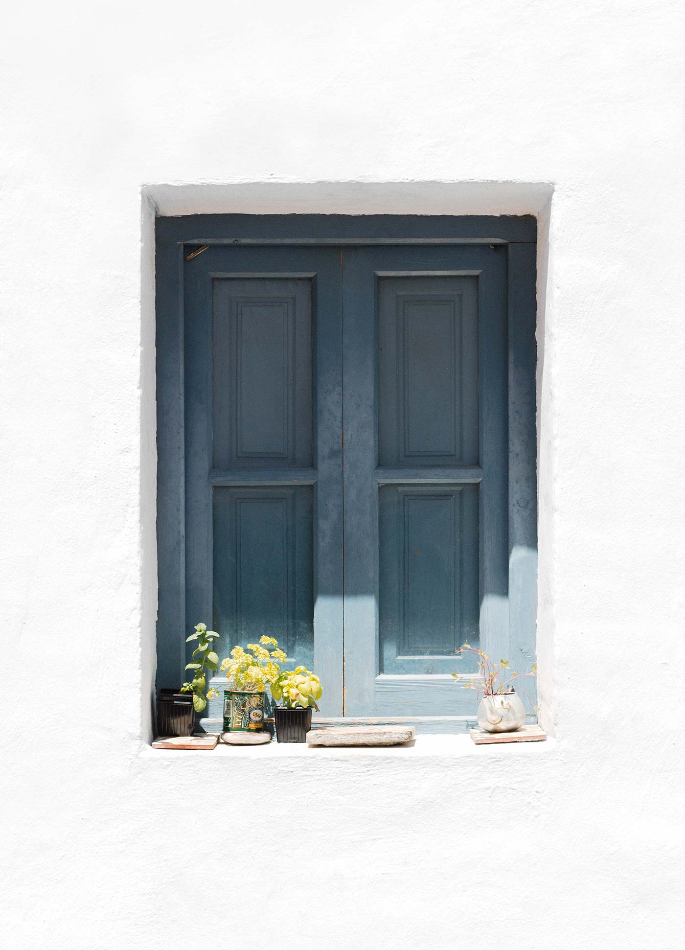
Oh! Look at this beautiful full-width Gallery. I took you by surprise, didn’t I?
There’s still, of course, the regular left and right alignments for images that you can use along with your text.
If you insist on seeing, it here’s an example. But now I’ll really need some serious lorem ipsum. Something like lorem ipsum dolor sit mauris a turpis pellentes biben dum magna ut congue ipsum mauris nec vesti bulum diam duis at leo.
Lorem ipsum dolor sit mauris a turpis pellentes biben dum magna ut congue ipsum. Mauris nec vestibulum diam duis at leo vitae dui aliquet volutpat proin egestas mattis augue.
Donec volutpat quam non hendrerit. Cras molestie sem eget augue pharetra, sit amet dictum justo tristique. Ut porta porttitor vestibulum ipsum dolor sit mauris a turpis pellentes biben dum magna ut congue ipsum mauris a turpis pellentes biben dum magna.
Any paragraph can have a background if you want. It makes highlighting parts of your text pretty easy. And you can use any color combination you’d like for this.
You can also use the Spacer block to…
… Create suspense.
(Or to create more space between things, whatever. It’s your call and your pixels.)
There is a block for what you do
What if you write poetry and need your text to respect the line breaks? Now you have a block for that, it’s called Verse and it looks like this:
Dear Theodosia, what to say to you?
You have my eyes
You have your mother’s name

When you came into the world, you cried and it broke my heart

I’m dedicating every day to you
Domestic life was never quite my style
When you smile, you knock me out, I fall apart
And I thought I was so smart

–Dear Theodosia / Lin-Manuel Miranda
What if you write code in your posts? No problem, dear dev. Here’s the Code block.
.gutenberg {
    display: block;
}
And maybe you usually offer files to download to your readers. Just use the File block, pal.
And use it in biiiiiig size if you want it.
Or are you one of those who wants to play an audio file right in your post? Use the Audio block. It’s pretty.
Go nuts with media and alignments
If you combine the new wide and full-wide alignments with galleries, you can create a very media rich layout, very quickly:
The above is a full-width image + a wide gallery with just two images. Galleries are an easier way to create visually appealing layouts, without having to deal with floats. Gutenberg will take care of the pictures size and alignment.
Videos can also be full-width or wide.
So… I guess what I’m trying to say is…
Now you can have a safe width for content that keeps your text readable, and big stunning media at the same time.
What a time to be alive!
Hungry for more blocks?
There’s the Latest Posts block, which lets you display a list of your most recent posts. Right. Here. As a list or in columns, and as many posts as you’d like. Really? Yes, really.
- I came here in a time machine that you invented
- One point twenty-one gigawatts
- We never would have fallen in love
- The molecular structure of Einstein
You know what? We have some tables too. Let’s not forget about tables. Here’s a wide Table, very useful for comparing fruits.
| Name | Color | Taste (1-10) |
| Banana | Yellow | 9 |
| Apple | Red | 7 |
| Watermelon | Red and green | 10 |
You’re about to see one of my favorite blocks. The
Ready? Go!
“If everything looks and reads the same, then probably nothing gets read or looked at.”
Mai Knoblovits
Ok, I just quoted myself. Sometimes you gotta do what you gotta do.
Here’s a serious question: what’s copy without a call to action? I bet many times you needed to add a neat call to action button within your post content. Fortunately, now there’s an easy way to do that thanks to the Button block.
If you want to learn more about Artisan Themes’ integration with Gutenberg, we have a full post about it (a serious post, no joking around like here).


